How did we get to our current logo?
When the first ACBS website was created, Eric Fox created the logo below in 2005/2006.

Prior to the existence of ACBS, Eric had created the acceptanceandcommitmenttherapy.com and relationalframetheory.com websites.

ACBS sincerely thanks Eric Fox for starting off our web presence. We don't know where we would be today without his significant efforts.
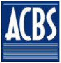
Between 2008-2010 we redesigned the website a bit, and created a new logo. Lacking funds, I (Emily Rodrigues) stayed up late one night creating this less than brilliant logo. (Design is not in my skillset unfortunately. Sorry everyone.)
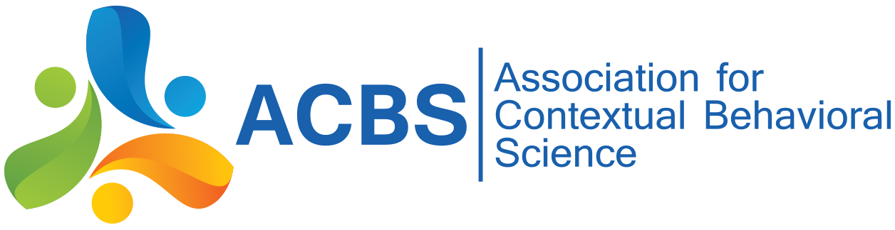
In 2010-2011 the ACBS website underwent a major renovation. With the new site unveiling in 2011, a new logo was commissioned for it.
We used a 3rd party design contest website to create our 2011 logo (which is still our logo as of 2019). This was the description we gave of what we wanted:
We want something a bit more modern, but still professional. (many company logos in our field look old and boring, we don't want that)
We need for this logo to not be trendy (in 10 years we still need to like it).
95% of the time this logo will appear in full color, but we don't want it to look horrible when in black & white.
We're flexible on colors as we're in the middle of a complete website redesign, but we think we want more than one color in our logo. We're currently looking at something like FF8F00, 5A8F29, 3C7DC4 or CD6607, 528413, 2088152, although we don't LOVE any of those yet. Those are just some ideas.
The design part of the logo only needs to include "ACBS" not the full name.
We do not want any typical themes. No images of the head or brain, no using the greek symbol for psychology. Nothing that looks like gears.
The only good symbology we can think of is something to do with "interconnectedness", but that's not required.
Our audience is primarily Ph.D. and master's level folks. We do a "new" and "different" kind of psychology (but still based on good science) so we can be a little more modern with our logo.
Don't go off of our current logo... it is lame... I designed it. :)
Staff and a few former and current Board members took a look at our options and selected our logo. We had a wide variety of options including logos with animals in it, etc.
I can only speak from my own experience in the process, but I didn't want a logo that reminded me of another company I knew, and I didn't want something busy. When looking at the logo I liked the idea of the six parts (like the hexaflex), and the 3 major ones (at the time, it made me think of ACT, RFT, and CBS... even though CBS is much more than that, it clicked with me at the time). This logo was not chosen for any of those reasons, but those are thoughts that occurred to me, and made me like the logo a bit more. Those were my relational frames. :) - Emily Rodrigues, ACBS